Abstract
Every designer has knowledge of tools when they start a design. Mostly they utilize some sort of format network to arrange the components. Grids are the backbone of all layouts. The grid system acts similarly to the print layout in organizing the elements on the page. It provides a guide for designers to form multiple layouts that support responsive themes for various screen sizes.
Introduction
A grid is like invisible lines that hold a style along. It is a series of vertical and horizontal lines that are used to separate a page vertically and horizontally into margins, columns.
When starting a design, grids are used to organize the elements. This helps to maintain the balance between page and slide.
In today’s world, all visual interactions are screen based, where content is viewed in multiple screens i.e.mobile phones, tablets, laptops, TVs and smartwatches. As a designer in any UI UX Design Company, this is our responsibility to deliver the pleasurable and friendly user experience to people. Grids can help us do that.

ANATOMY OF A GRID:
1. Format
The format is the full space in which designs are set out. In print style, the format is the page while on the web, the format is the size and area of the browser window.
2. Margin
Margins are the empty areas between the sides of the format and content. We can also say that margins are the negative space between the inner edge of the format and the outer edge of the content.
3. Column and alleys
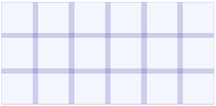
A grid is formed of 2 main components: columns and alleys. Columns are square measure building blocks of grids. The area between columns is remarked as alleys.
4. Modules
Modules are the building blocks of the grid. They are basically the spaces between the columns and rows. Vertical groups of modules, together, create columns. Horizontal groups create rows.
TYPES OF LAYOUT GRIDS:
There are a lot of different types of grid, and they all serve different purposes.
• manuscript grid
• column grid
• modular grid
• baseline grid
Manuscript Grid:
This is a one-column grid which simply determines that where the text will sit, in a page. Manuscript grids are utilized in documents, e-books, pdf and display with uncountable text.
Column Grids:
These are used for magazines to set content in columns, making it easier to browse. This is the most widely recognized kind of grid utilized by graphic and website designers.
Modular grids:
A modular grid is similar to a column grid, however, it additionally has rows. Modular grid separates a page both vertically and horizontally into modules.
Baseline Grids:
A baseline grid is a heavy and dense grid of equally spaced horizontal lines that determine where the text will sit. Baseline grids are often used in combination with column grids, to make sure that the lines of text in each column align uniformly across a spread. This grid creates a decent reading rhythm for any style with uncountable text.

GRIDS In Interactive Design
The grid system helps to align the elements based on the sequenced order of row and columns. Designers used a column based structure to place the images and text in a logical way. With the help of interaction design, designers changed the way of thinking about the grids.
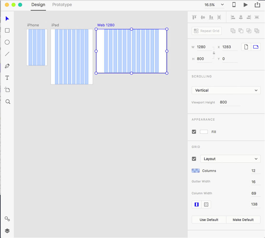
Interaction design doesn’t have a fixed size because there are various types of devices to interact with the product from small screens to larger TV screens. Designers must organize the content in the most interactive and user-friendly way. The very first way to achieve it by using a layout grid system. This type of grid is easier to design for multiple screens and resolutions.

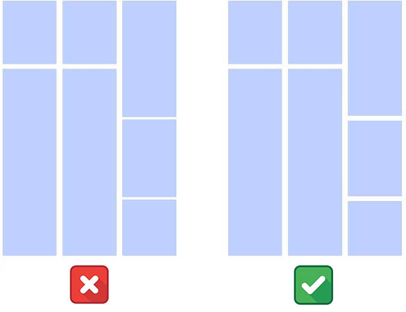
Pay Attention to both Horizontal and Vertical spacing
Laying out a grid requires paying adequate attention to horizontal and vertical rhythms. Look at the difference between the examples, given below. In 1st design, the grid as per the column dimension and horizontal spacing. In 2nd design, both horizontal spacing and vertical spacing are consistent, that makes the general structure cleaner and easier to visually consume the content.

Hope this article helps you to understand the grid systems, what they are and how they can be applied to your design process.
About Author:
Ramandeep Kaur is a full-time designer with 6+ years of experience in User Interface and User Experience. She has successfully delivered 100+ projects (Mobile Apps / Desktop Apps / Responsive Websites) to client across the Globe.
About QSS:
QSS Technosoft is a leading ui ux design company and has a proven track executing enterprise level applications incorporating best of UI/UX both for web and mobile. The company has a core competency in developing and delivering projects having rich look designs with high usability. The UI/UX competency has experienced and dedicated team of UI/UX engineers.

A Beginner's Guide to Layout and Grids